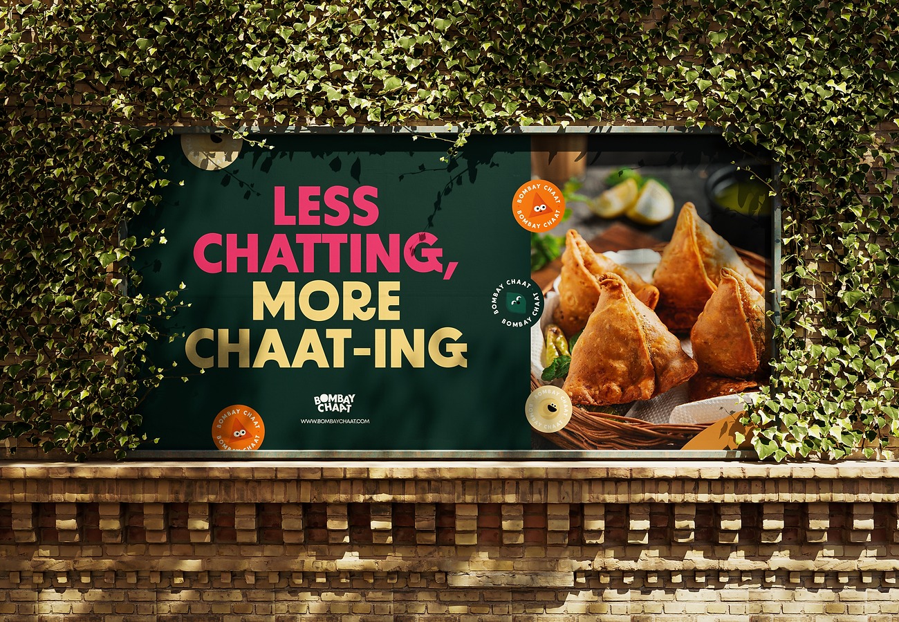
Bombay Chaat Rebrand
A fresh look to a not-so-fresh branding of Bombay Chaat, a small road-side shop in the city of Chennai, which is in Tamil Nadu, India. For years it has been doing business without proper branding and identity, and could use a visual refresh! This shops sells one of the best 'chaat' in the city, and it pains me to see their bland visual identity that shoos some potential customers away. The aim was to give it a modern, fresh and exciting look with suitable aesthetics and visuals for the brand.
The idea behind this rebrand is an attempt to modify the entire brand positioning of Bombay Chaat, in order to attract a wider range of customers. Since 'chaat' is an Indian snack that is prepared on the spot and entirely by hand, customers tend to create pre-determined assumptions of the shop being 'unclean & untidy' due to its un-attractive visual identity, though their processes are actually very sterile. This branding uses bright colours and solid shapes that represent different kinds of chaat. The overall visual identity is minimal, neat and clean and gives a fresh, inviting look and feel.


Related Projects


